
Prizm Content Connect
HTML5 Viewer
| User Guides > PCC Imaging Services (PCCIS) > Using PCC - Overview > Components > Client Components > HTML5 Viewers > HTML5 Viewer |
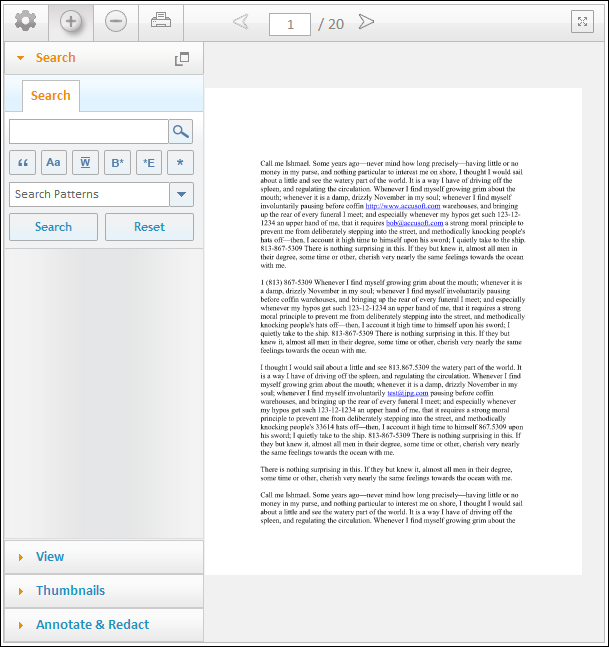
The PCC HTML5 Viewer allows users to view, navigate, annotate and redact documents. The components that control the behavior and interaction of documents are located either on the navigation bar or within the toolbox menu. The toolbox is broken into three distinct tabs: Search, View, Thumbnails and Annotate and Redact. Each tab contains a unique set of controls that allow users to interact with a document.
The viewer is a jQuery component that is comprised of JavaScript, HTML, CSS and utilizes jQuery and jQuery UI. The HTML5 Viewer is ideally suited for both desktop and mobile applications.
Example of the HTML5 Viewer:
The HTML5 Viewer is dependent on multiple CSS and JavaScript files. In order to successfully render the HTML5 Viewer, the following files will need to be included within the <head> tag of your HTML document:
| Example |
Copy Code
|
|---|---|
    <script src="js/jquery-1.7.2.min.js" type="text/javascript"></script>
    <script src="js/jquery-ui-1.8.21.custom.min.js" type="text/javascript"></script>
    <script src="js/pccViewer.js" type="text/javascript"></script>
|
|
The following table provides the file name, description and location:
|
File |
Description |
Location |
|
jquery-1.7.2.min.js |
jQuery, JavaScript library |
C:\Prizm\Samples\Html5\.net cs\js |
|
jquery-ui-1.8.21.custom.min.js |
jQuery UI, JavaScript library |
C:\Prizm\Samples\Html5\.net cs\js |
|
pccViewer.js |
PCC Plugin |
C:\Prizm\Samples\Html5\.net cs\js |
The Prizm Content Connect installation includes sample files to help get you started quickly using the viewer. Refer to the Integrating with Your Application section for more detail on how to set up the samples.
The HTML5 Viewer’s navigation bar consists of several components that allow users to interact with a document. These components consist of the Toolbox menu, Zoom-In, Zoom-Out, Page Navigation and Full-Screen mode. The following table provides the icon name, icon image, and description:
|
Toolbox Menu
|
The Toolbox menu may be opened or closed by clicking on the cog-wheel icon. |
|
Zoom-In
|
The Zoom-In button allows users to zoom-in to a document loaded within the viewer. |
|
Zoom-Out
|
The Zoom-Out button allows users to zoom-out of a document loaded within the viewer. |
|
|
The Print button allows users to print the document that is currently loaded within the viewer. |
|
First Page
|
The First Page button allows users to navigate to the first page of the document. |
|
Previous Page
|
The Previous Page button allows users to navigate to the previous page of the document. |
|
Next Page
|
The Next Page button allows users to navigate to the next page of the document. |
|
Last Page
|
The Last Page button allows users to navigate to the last page of the document. |
|
Page Input
|
The Page Input box allows users to manually type the page number of the document that they would like to view. |
|
Fill Screen
|
The Full Screen button allows users to display the viewer to the maximum size within the browser. |
The toolbox displays four distinct tabs: Search, View, Thumbnails and Annotate & Redact. Each tab contains a unique set of controls that allow users to interact with a document.
The menu may be opened or closed by clicking on the cog-wheel icon, located in the top-left of the viewer.
The menu has drag-and-drop functionality that allows users to move it to a new location within an HTML document. In order to move the menu to a new location, left-click and continue to press the mouse down on the icon. While holding the mouse down, drag the menu to its new location. The Toolbox Menu will automatically dock itself if it is within a 50-pixel proximity to its original location at the top-left of the viewer.
The Search tab consists of components that allow users to search documents within the viewer. The following table provides the icon name, icon image, and description:
|
Search Tab
|
The Search Tab allows users to select the criteria they want to use for their search. |
|
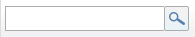
Search Field with Magnifier Tool
|
The Search field with Magnifier Tool allows users to enter search terms. |
|
Match Exact Word or Phrase Tool
|
The Match Exact Word or Phrase Tool allows users to search for an exact word or phrase. |
|
Match Case Tool
|
The Match Case Tool allows users to search for upper or lowercase words. |
|
Whole Word Tool
|
The Whole Word Tool allows users to search for a whole word that may also have a prefix or suffix and will return all matches relating to the whole word. |
|
Begins With Tool
|
The Begins With Tool allows users to search for the first three (or more) letters or numbers. |
|
Ends With Tool
|
The Ends With Tool allows users to search for the last three (or more) letters or numbers. |
|
Use Wildcards Tool
|
The Use Wildcards Tool allows users to search for terms using an asterisk (*) or question mark (?) in place of a letter or number. |
|
Search Patterns/Predefined Drop-down Menu (with Clear All and Select All)
|
The Search Patterns/Predefined Drop-down Menu (with Clear All and Select All features) allows users to select various search criteria from a default or predefined terms list. |
|
Search Button
|
The Search Button allows users to begin their search after selecting specific criteria. |
|
Reset Button
|
The Reset Button allows users to clear all of their search criteria and start a new search. |
|
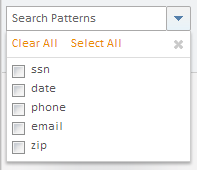
Previous Searches/Clear All Button
|
The Previous Searches area allows users to view all of their searches. The Clear All Button allows users to remove all of their previous search history. |
|
Results Tab
|
The Results Tab allows users to view their search results. |
|
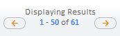
Displaying Results with Previous and Next Buttons
|
The Displaying Results area with Previous and Next Buttons allow users to page through their search results. |
|
Clear Results Button
|
The Clear Results Button allows users to remove all of their search results and start a new search. |
|
Right-click Menu
|
Right-click on the document to choose one of the following:
|
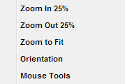
The View tab consists of components that allow users to interact with how the document appears visually within the viewer. The following table provides the icon name, icon image, and description:
|
Magnify Tool
|
The Magnify Tool allows users to zoom-in to a particular area of a page while pressing the mouse down within the viewer. |
|
Select-To-Zoom Tool
|
The Select-To-Zoom Tool allows users to select a particular area of a page with their mouse. Once the selection is complete, the viewer will zoom-in to the selected area. |
|
Pan Tool
|
The Pan Tool allows users to pan within a page, but only when the user has zoomed-in and the page is larger than the viewer. |
|
Rotate Right
|
The Rotate Right button allows users to rotate the page 90-degrees clockwise. |
|
Rotate Left
|
The Rotate Left button allows users to rotate the page 90-degrees counter-clockwise. |
|
Fit Full Image
|
The Fit Full Image button will fit an entire page into the viewer. |
|
Fit-to-Width
|
The Fit-to-Width button allows users to fit the page to the width of the viewer. |
|
Fit-to-Height
|
The Fit-to-Height button allows users to fit the page to the height of the viewer. |
|
Actual Size
|
The Actual Size button allows users to view the page at its actual size. |
|
Text Selection
|
The Text Selection tool allows users to highlight and copy text on SVG enabled documents. If Text Selection is not enabled for the document, the tool will be disabled. |
|
About PCC
|
The About button will display product information such as the version number. |
|
Right-click Menu
|
Right-click on the document to choose one of the following:
|
The Thumbnails tab consists of thumbnail images, one for each page, which users may click to navigate to. If an annotation or redaction is drawn within the viewer, it is also updated within the thumbnail.
|
Right-click Menu
|
Right-click on the document to choose one of the following:
|
The Annotate & Redact Tabs are broken into two sub-tabs, Annotate and Redact. The Annotate sub-tab contains components that allow users to annotate within a page; similarly the Redact sub-tab contains components that allow users to redact within a page.
 |
Licensing - In order to annotate and redact, the appropriate license will need to be configured with the product. In the event that the PCC Viewer is not licensed for annotations or redactions, the tab(s) will be disabled from being used. |
The following table provides the icon name, icon image, and description:
|
Save Annotations & Redactions
|
The Save button will save both annotations and redactions that have been generated on every page throughout the document. | ||
|
Load Annotations & Redactions
|
The Load button will load both annotations and redactions for each page within the document. | ||
|
Annotation Filename (Input field only - no icon) |
The Annotation ID is an input field that allows users to specify the ID of the annotation file that they would like to save and/or load. | ||
|
Edit Annotations & Redactions
|
The Edit button will allow users to edit both annotations and redactions that have been generated or loaded within the viewer. | ||
|
Delete Annotations & Redactions
|
The Delete button will delete any annotations or unsaved redactions that have been selected while in edit mode. | ||
|
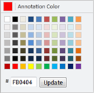
Color Picker
|
The Color Picker allows users to select a color for annotations and text redactions. In order to change the color for annotations or text redactions, click the label that reads Annotation Color or Text Color. The user may then click on a pre-determined set of colors or may enter a custom HEX color code and press the Update button. | ||
|
Right-click Menu
|
Right-click on the document to choose one of the following:
|
The Annotate tab contains components that allow users to annotate within a page. The following table provides the icon name, icon image, and description:
|
Arrow Annotation
|
The Arrow button will allow users to draw arrow annotations. |
|
Line Annotation
|
The Line button will allow users to draw line annotations. |
|
Rectangle Annotation
|
The Rectangle button will allow users to draw rectangle annotations. |
|
Ellipse Annotation
|
The Ellipse button will allow users to draw ellipse annotations. |
|
Transparent Annotation
|
The Transparent Rectangle button will allow users to draw a transparent rectangle with the color of their choice. |
|
Text Annotation
|
The Text button will allow users to write text annotations. Users may select a font family, size, color, bolded or italicized and left, center and right alignment. |
|
Stamp Annotation
|
The Stamp Annotation button will allow users to draw stamp annotations. Users may select a stamp color. To create your own stamp labels see the stampAnnotationLabels parameter. |
|
Highlight Annotation
|
The Highlight Annotation button will allow users to draw highlight annotations. Users may select a highlight color. |
The Annotate tab contains components that allow users to annotate within a page. The following table provides the icon name, icon image, and description:
|
Filled Rectangle Redaction
|
The Filled Rectangle button will allow users to draw filled rectangle redactions. The color of this redaction will always be black. |
|
Transparent Rectangle Redaction
|
The Transparent Rectangle button will allow users to draw a transparent rectangle. The color of this redaction will always be yellow. |
|
Text Redaction
|
The Text Redaction button will allow users to write text redactions. Users may select a font family, size and color. |
|
Stamp Redaction
|
The Stamp Redaction button will allow users to create redaction stamps. To create your own stamp labels see the stampRedactionLabels parameter. |


